Pantone recently announced their new “2020 Color of the Year” which gets many people in the design community talking and sharing inspired ideas. Pantone, which describes itself as “the authority on color, provider of color systems and leading technology for accurate communication of color” is one of many organizations and companies working in the field of color forecasting.
Pantone offers a color system (used by many designers and graphic designers) so that a particular color can be identified precisely. Instead of trying to describe a shade of blue as “intense blue with a slight gray hue”, a designer can specify Pantone 19-4052 and others within the industry will know the EXACT color. As we all know, there are literally thousands of permutations of a particular color and getting it “just right” is important – critically important.
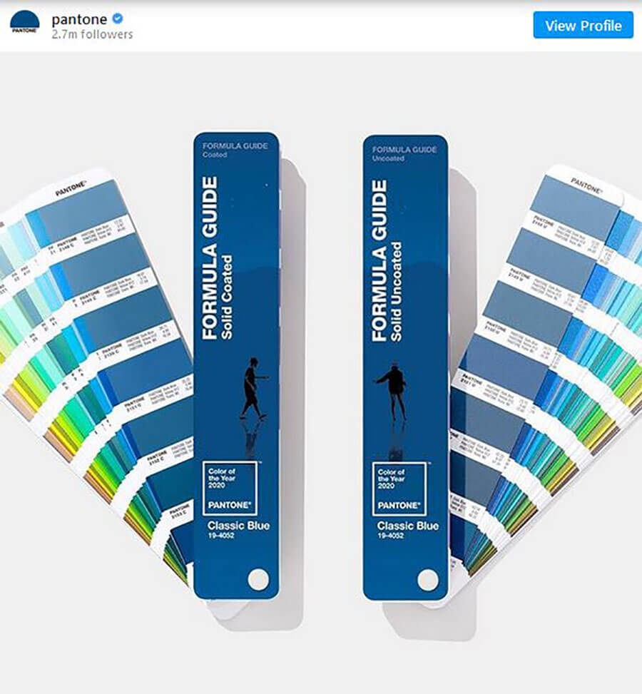
Photo by @Pantone on Instragam
Pantone’s 2020 Color of the Year, is Classic Blue. Leatrice Eiseman, Executive Director of the Pantone Color Institute, describes it as “Classic Blue, a solid and dependable blue hue we can always rely on.” She goes on to explain, “Imbued with a deep resonance, Classic Blue provides an anchoring foundation. A boundless blue evocative of the vast and infinite evening sky, Classic Blue encourages us to look beyond the obvious to expand our thinking; challenging us to think more deeply, increase our perspective and open the flow of communication.”
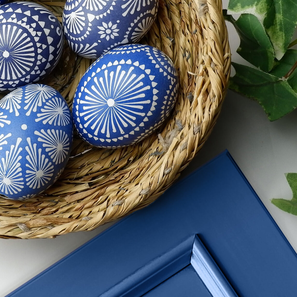
Dura Supreme Cabinet door shown in a Custom Finish to Classic Blue
Sounds interesting and exciting, but regardless of the description designers often get asked, “How do I incorporate trendy colors into my kitchen or renovation project and yet keep it timeless for long-term style?”
The important thing to remember with color palettes for kitchen cabinetry and kitchens, in general, is that cabinetry is not a soft good that can be easily and inexpensively updated with changing color trends. Soft-goods like wall paint colors, accessories, throw pillows, side chairs, etc. CAN be easily updated and those are some of the areas to incorporate more daring colors. Colors for cabinetry, carpet, countertops, and large furnishings should perhaps be more classic and long-term color investments, but they can still be fashion-forward and cutting edge.
Dura Supreme Cabinetry show in the Kendall door style with “Zinc” and “Frank Blue” (SW 6967) painted finishes by Kristin Donnelly of Reynolds Design Remodeling. Photo by J Norton Photo Design.
You’ll notice that interior designers and color designers will usually use more neutral colors (like white, ivory, taupe, gray, or brown) for the majority of the kitchen cabinet color selections, and then use more daring, trendy colors for accessory or accent items (i.e. a kitchen island, curtains, decorations, or backsplash). At Dura Supreme, definitive trends in kitchen cabinetry colors right now are true-brown stain colors (like our Morel, Coriander, Cashew, Feather, Praline, and Mocha stains), Gray stains and paints (like our Heather, Pebble, Caraway, Shell Gray, and Smoke stains as well as our Pearl, Silver Mist, Zinc, Storm Gray, and Graphite paints to name a few), or shades of white paint that can be a neutral backdrop for any color.
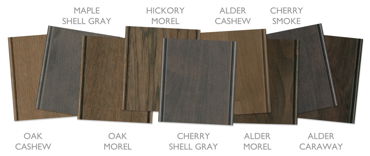
A selection of true-brown and gray stain colors from Dura Supreme Cabinetry
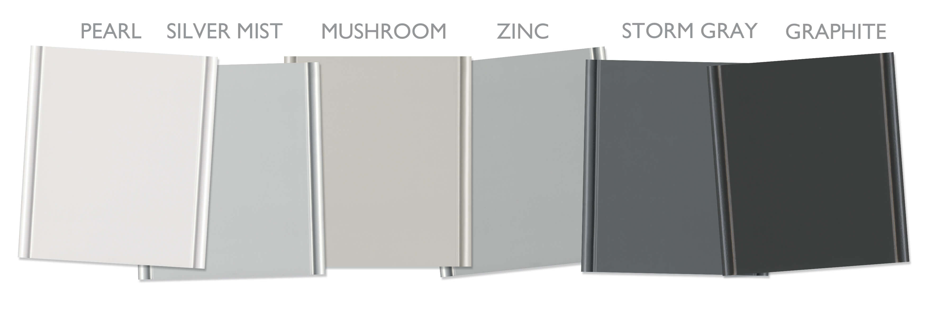
A selection of gray paint colors from Dura Supreme Cabinetry
By the way, GRAYS (in all shades) has definitely been an industry-leading color trend and is very prevalent and attractive for all interiors – and they are an outstanding neutral color to showcase trendy accent colors.
Muting a Trendy Color For Large Design Elements
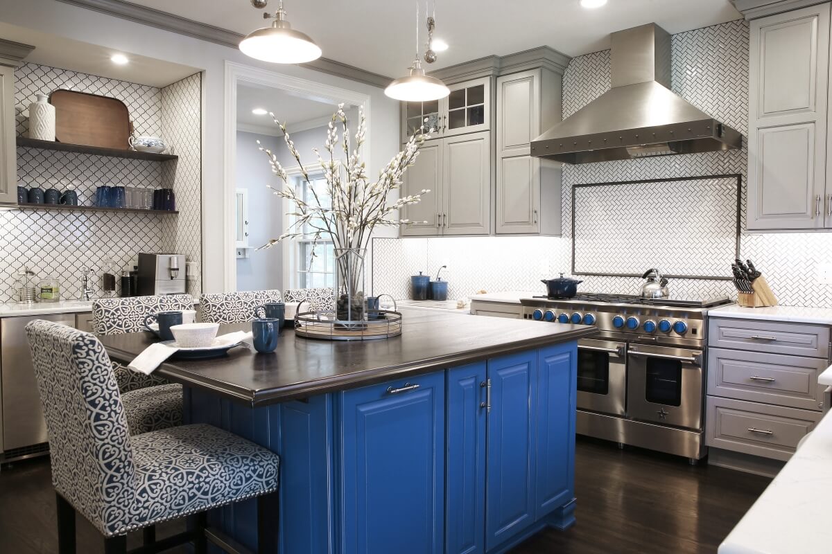
Muting a trendy color like Classic Blue can be useful if you’d like to incorporate the on-trend color with large-scale or large investment design elements, like cabinetry. This can help the color palette appear more timeless. The Curated Color Collection by Dura Supreme is designed and managed by our team of color forecasters to provide a selection of trendy, yet long term classic colors for cabinetry. Annually this collection is reviewed and updated to stay current an on-trend. It’s no surprise, “Gale Force” has been the leading color in our Curated Color Collection for 4 years in a row! This classic blue finish is more of a muted, more neutral shade of blue destined to be a classic color for years to come. These are fantastic examples of how kitchen designers can utilize a very fashion-forward color and worked it into a kitchen color palette that will be classic and lasting for the long term!
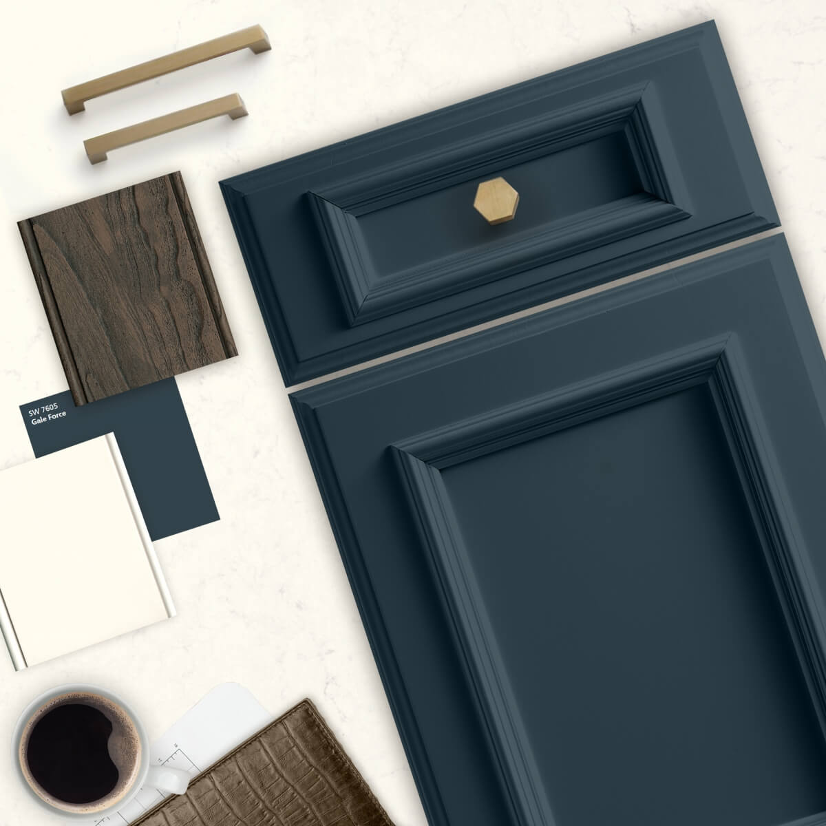
Dura Supreme’s St. Augustine door style shown in “Gale Force” by Sherwin-Williams.
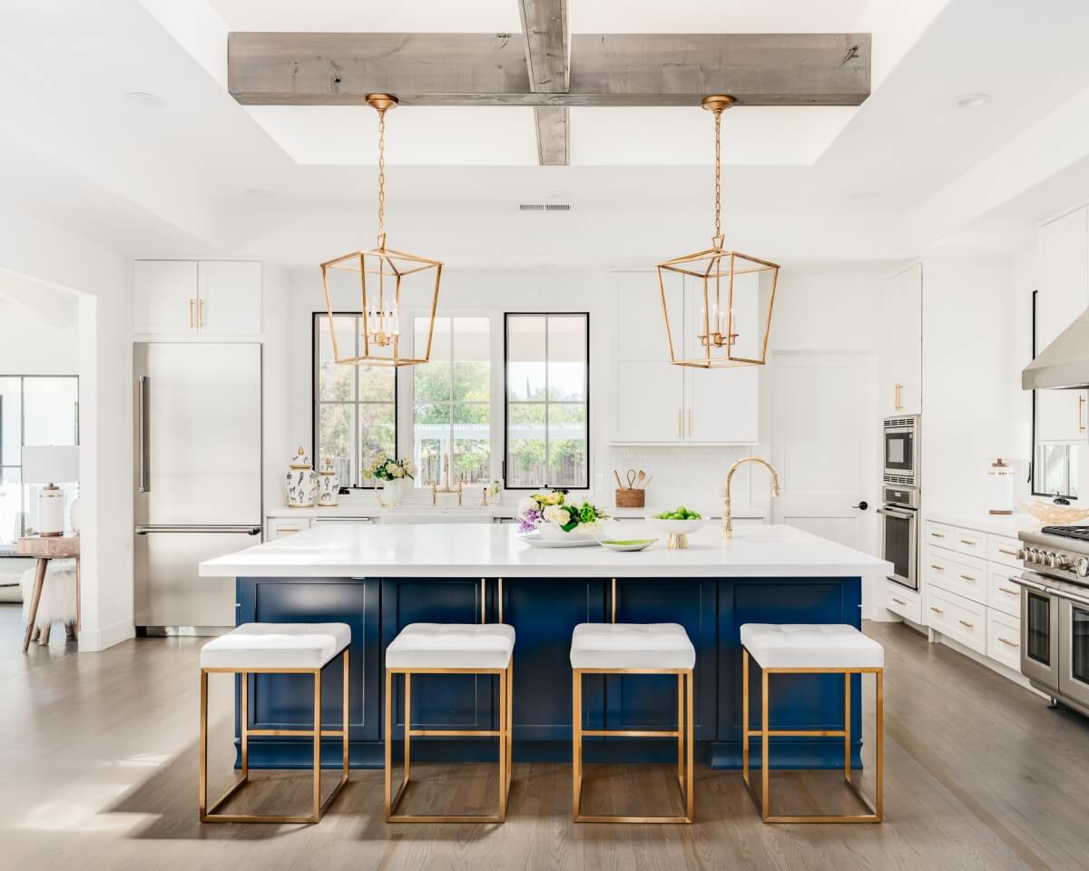
This kitchen design by Helena Steele of Golden Gate Kitchens features a classic blue “Gale Force” kitchen island while the rest of the cabinetry is a neutral white paint. Photo by Christopher Stark and Interior Design by Susan Love Design.
Dura Supreme Cabinetry shown in Gale Force paint combined with a Morel stain on Hickory wood.
Dura Supreme Cabinetry shown in Gale Force paint combined with a Morel stain on Hickory wood.
Dura Supreme Cabinetry shown in the “Gale Force” painted finish.
Use The Trendy Color On Easy To Replace Design Elements
When working with very “now” trendy colors. Try implementing the bold color to small or easy to replace items (i.e. barstools, light fixtures, backsplashes, kitchen island, wall paint, etc.) so if you grow worn of the color after a few years or if you plan to sell your home the items are easy to switch out.
This design uses Classic Blue accented with the light fixtures and kitchen island stools. Dura Supreme kitchen design by Danielle Bohn, CMKBD of Creative Kitchen Designs, Inc. Photo by Dave M Davis Photography.
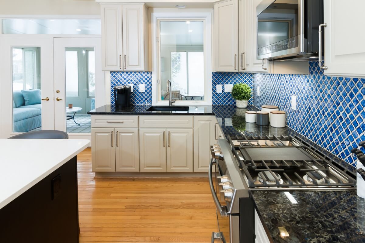
Classic Blue used as the backsplash. Design by House to Home Solutions.
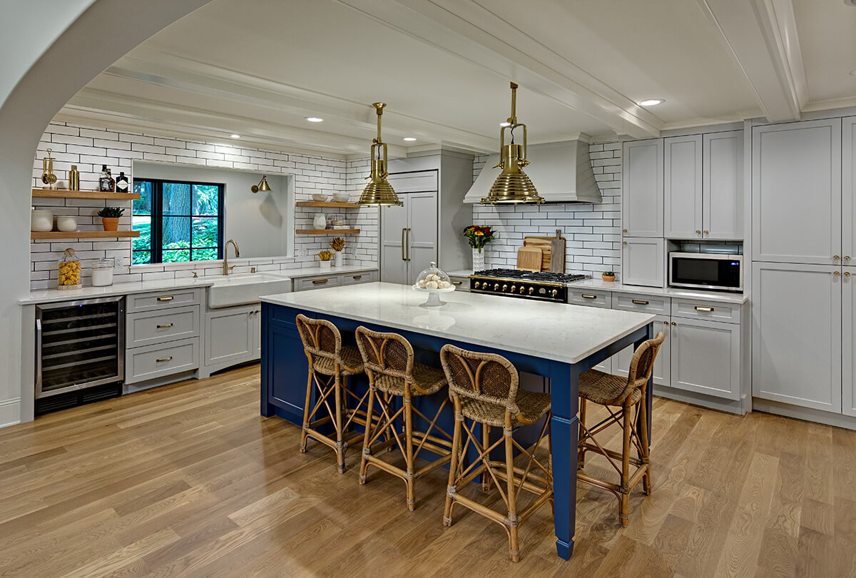
Dura Supreme kitchen design with a Classic Blue kitchen island. Design by Boyer Building Corporation. Photo by Mark Ehlen of Ehlen Creative Communications.
In LOVE with the trend… Go all out!
Color is a highly personal preference for most people and although there are specific colors that are considered “on trend” or fashionable, color choices should ultimately be based on what appeals to you personally. If you’re absolutely in love with a color, trend or not, why not embrace it entirely? Your home should be a place of comfort, joy, and a space to fully express yourself. I truly feel if you are 100% confident with your favorite color, and that color brings you joy, don’t hold back!
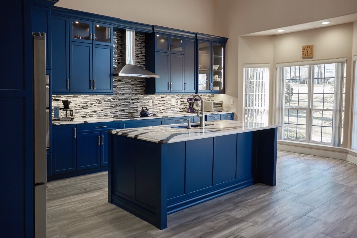
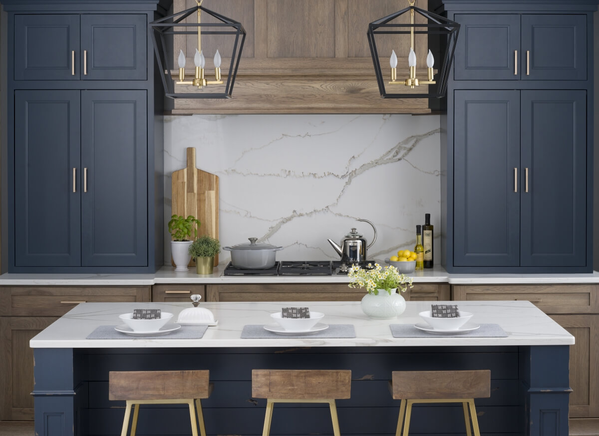
Dura Supreme kitchen design shown in the Kendall Panel door with a “Loyal Blue” Personal Paint Finish. Design by The Design Team at Artistic Cabinetry, LLC. Photo by HM Photography.
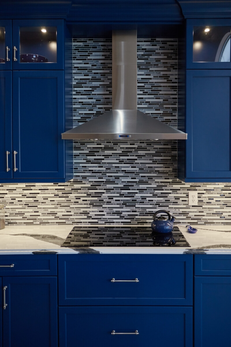
Dura Supreme kitchen design shown in the Kendall Panel door with a “Loyal Blue” Personal Paint Finish. Design by The Design Team at Artistic Cabinetry, LLC. Photo by HM Photography.